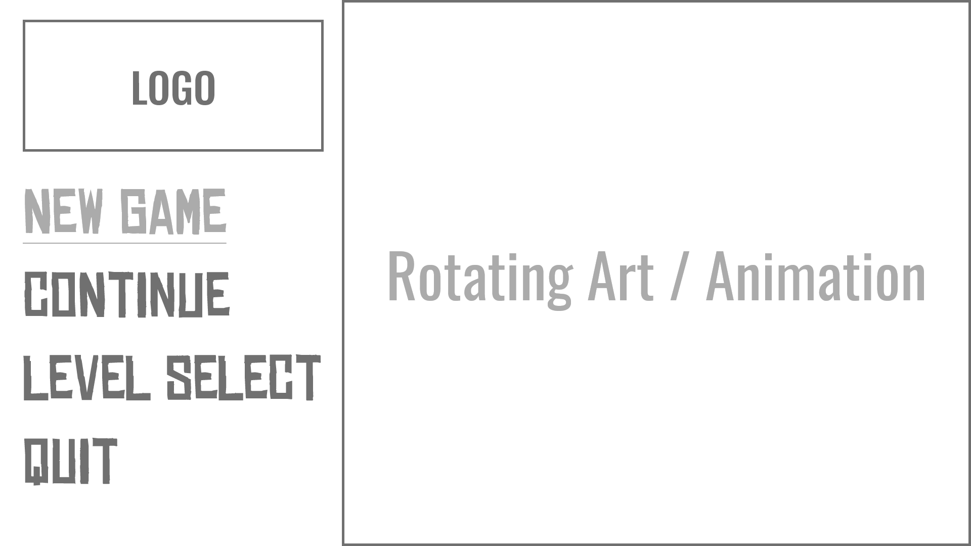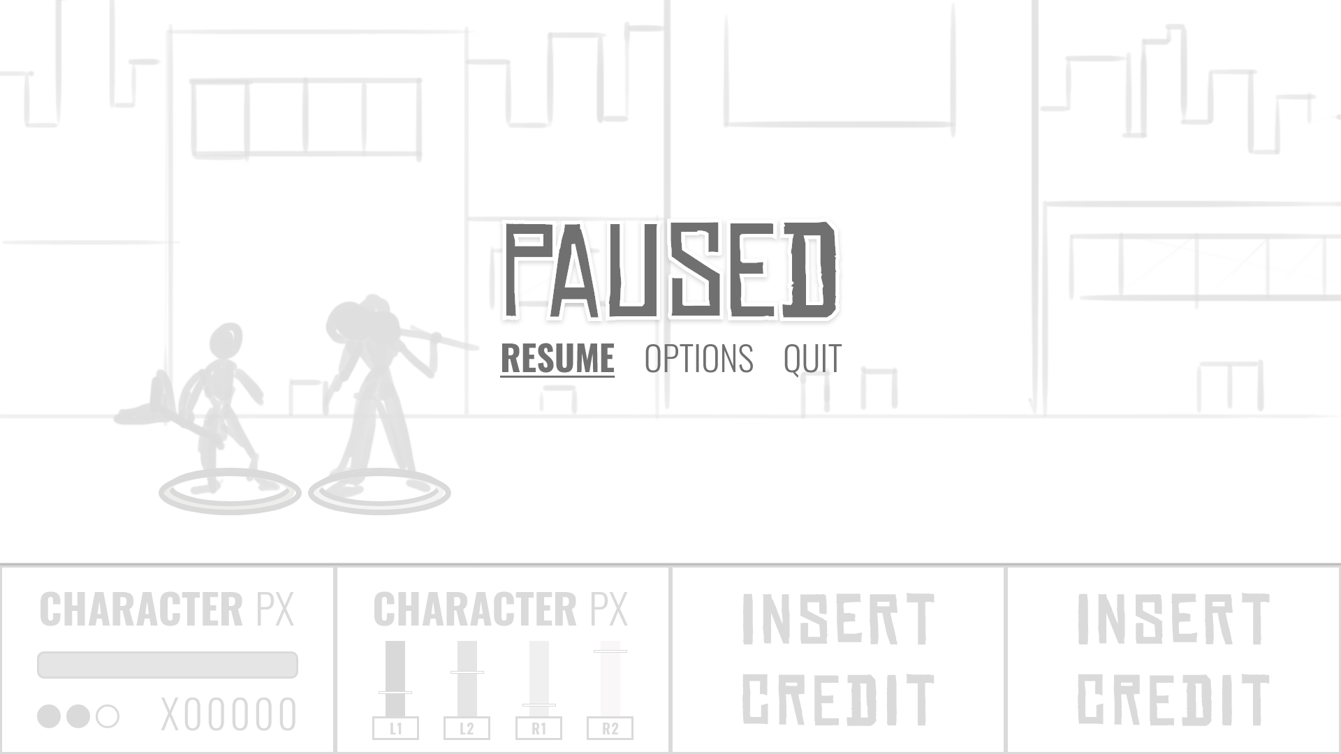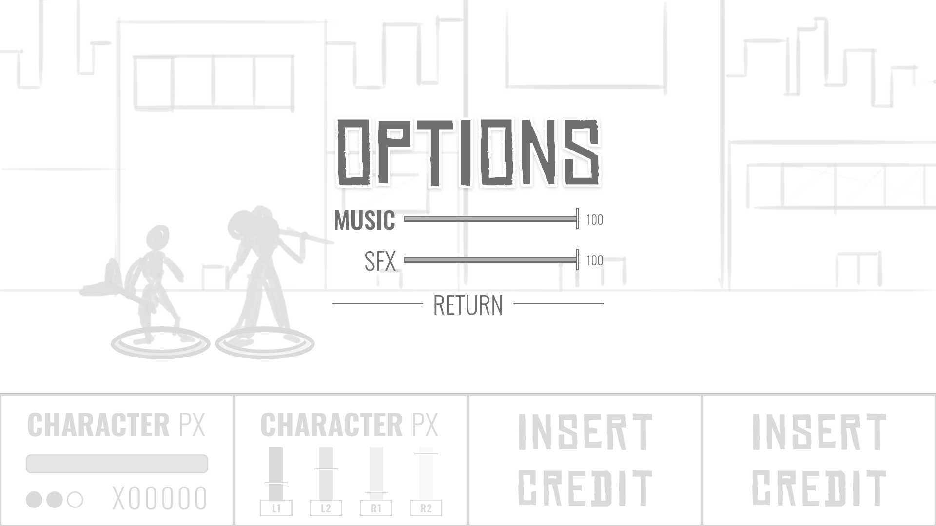


Stereo City is a game project I helped with some wireframes and UI with others in my degree program. It is a 2D beat-em-up style game with a rhythm mechanic to add an exciting twist to the combat system. Stereo City is meant to look at feel like a classic arcade game, so the UI needed to reflect that. For the design, I wanted an edgy sort of punk-rock feel for the headline images such as “Insert Credit” and “Paused” as well as the main nav. While these specific typefaces weren’t set in stone, it was to give the dev team an idea of what I was thinking. Clean fonts for character info and numbers, punky fonts for headlines. While this was getting reviewed by the team, I moved on to getting the UI implemented in Unity with placeholder assets.
Main Menu working in Unity.
Once I got feedback to replace the “Level Select” button with an “Options” button, I got imported into Unity and linked the buttons to the proper actions. Once the team reviewed the new menu, they wanted the placeholder assets to be removed in lieu of more visually appealing options. So I made button graphics as placeholders instead of Unity defaults, and added hover states to better illustrate to the team the basic visual feedback the users would get. This was also a fun learning experience since I had never tried to import a photoshop document with multiple art boards before, and was able to turn it into a sprite sheet and save file space that way.
New placeholder visuals in engine.

